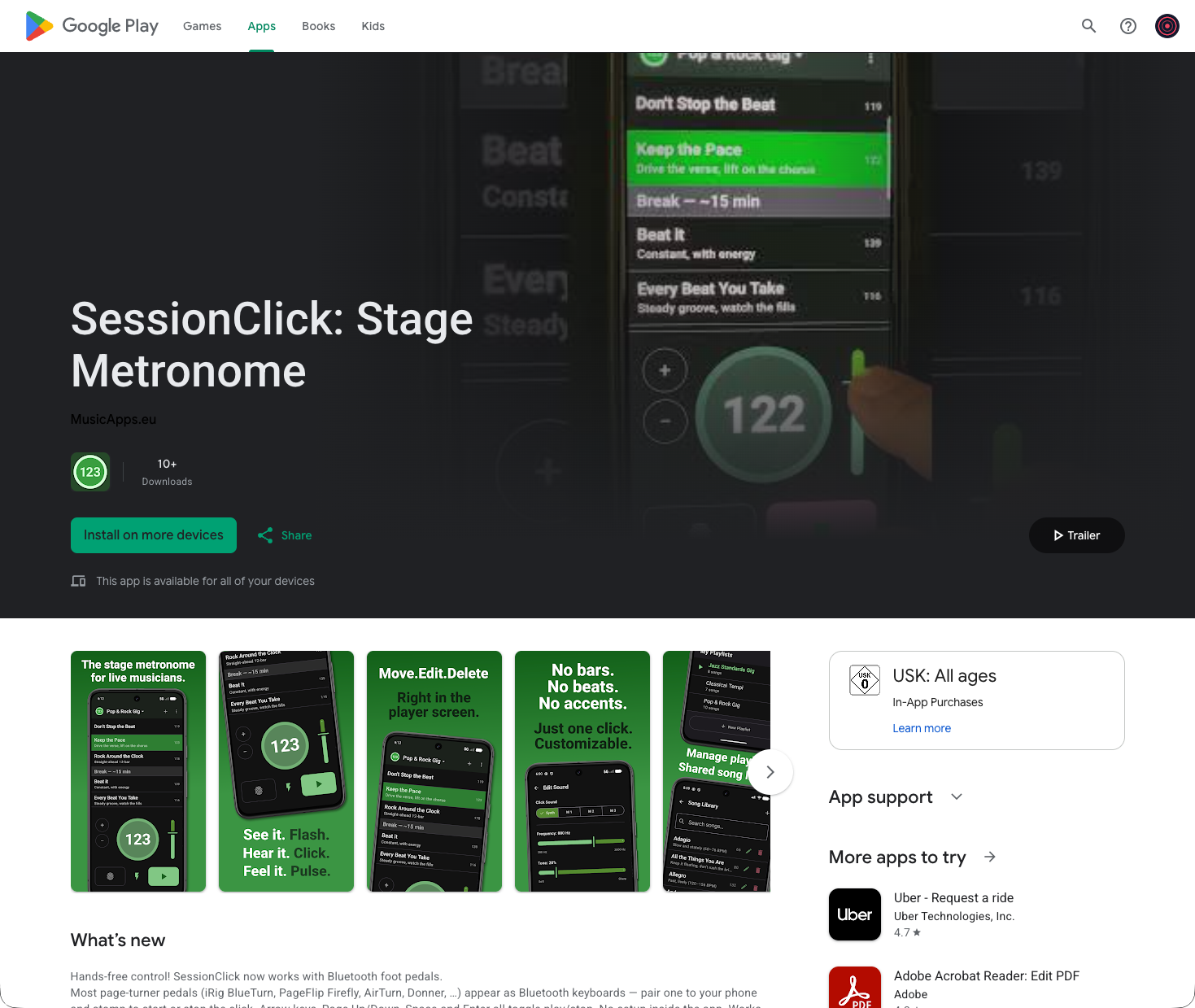
The SessionClick listing on the Play Store still used raw screenshots of the app. Most apps in the store add text overlays to sell features rather than just show UI, so today I fixed that.
Picking what to show
I asked Claude for advice on what a good Play Store screenshot set looks like. The short version: one feature per image, readable in a second at thumbnail size, parallel structure across the set so they feel like a series. Lead with the differentiator, not the home screen.
I picked four features to highlight:
- Combined player and playlist on one screen
- In-place playlist editing
- Visual, audio, and haptic feedback
- Hands-free pedal control
Writing the copy
This is where Claude earned its keep. I’d draft a line, Claude would point out what was off, and we’d iterate. A few examples:
- For the feedback slide I started with “See it. Big Flashing Light. / Hear it. Customized Click Sound. / Feel it. Vibration along the Beat.” Clumsy. Landed on Flash. Click. Pulse. — one word each, same shape.
- For the playlist slide my draft was “In place editing for the Playlist. Move, Edit, Delete in main screen.” Claude flagged “in place editing” as too technical and that “in main screen” isn’t idiomatic. We ended up with Move. Edit. Delete. to mirror the rhythm of the feedback slide.
- For the metronome slide I wanted to say there’s no time signature and no accents — deliberately. Claude reframed that as a confident negative: No time signatures. No accents. with “Just one click — exactly the way you want it.”
- For the pedal slide: Start. Stop. Hands free.
The period-after-every-word rhythm became the through-line for the whole set. That was Claude’s idea after the second headline and I kept it.
Claude also corrected a couple of Germanisms I hadn’t noticed — optical → visual, along the beat → on the beat, in main screen → on the main screen.
Putting the images together
The actual design work was mine. I took screenshots from the Android Studio emulator, composed each slide in Affinity Designer — phone mockup, background, headline, subline — and uploaded the new set to the Play Console.
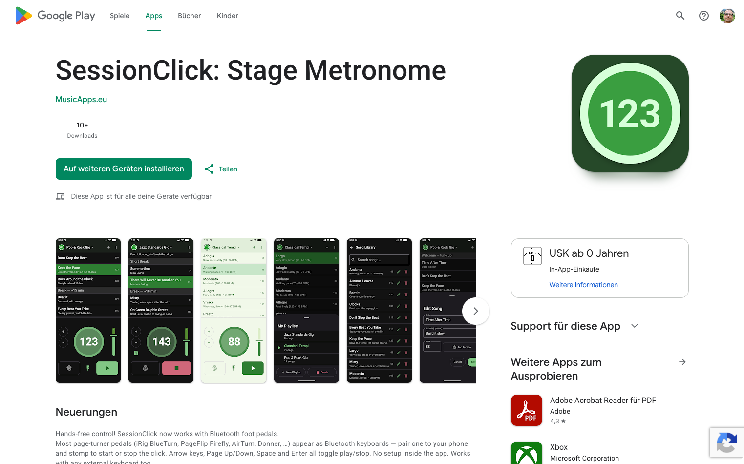
Old Play Store listing (web view)
New Play Store listing (web view)
Where the AI helped vs. didn’t
- Me: picking which four features to highlight, the screenshots from the emulator, the entire visual composition in Affinity Designer, and uploading to the Play Console.
- Claude: the headline copy, catching the German-English slips, suggesting the period-rhythm pattern that ties the slides together, and ordering advice (put the most distinctive feature near the front).
- Gemini: not involved today — no app code changed.
Today’s changelog
- New: feature-framed screenshots on the Play Store listing, replacing raw app screenshots.
- New: consistent copy rhythm across the set (Flash. Click. Pulse. / Move. Edit. Delete. / Start. Stop. Hands free.).
Time spent today: ~90 minutes, mostly in Affinity Designer lining things up.
This blog documents my attempt to build and ship a music app as a solo developer, with AI assistance. The AI does a lot of the work. I try to be specific about what.